Website & Portal for Insurance Company
NAMICO, organized in 1986 by the National Association of Mutual Insurance Companies, provides policyholders in the professional liability market with a suite of products. With a focus on their customers, they wanted their site to be more user-friendly and easier to navigate.
Our Challenges
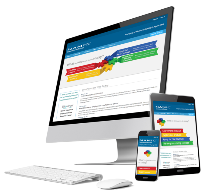
Their current site had confusing navigation and needed to be more dynamic and responsive to the requests of their customers. Also, because their current logo was comprised of four very contrasting colors, we were challenged to balance the color approach on the website without changing the actual logo colors. Another challenge was to create a simple, well-defined registration form for their end-user customers, to facilitate the online registration process.
Our Approach
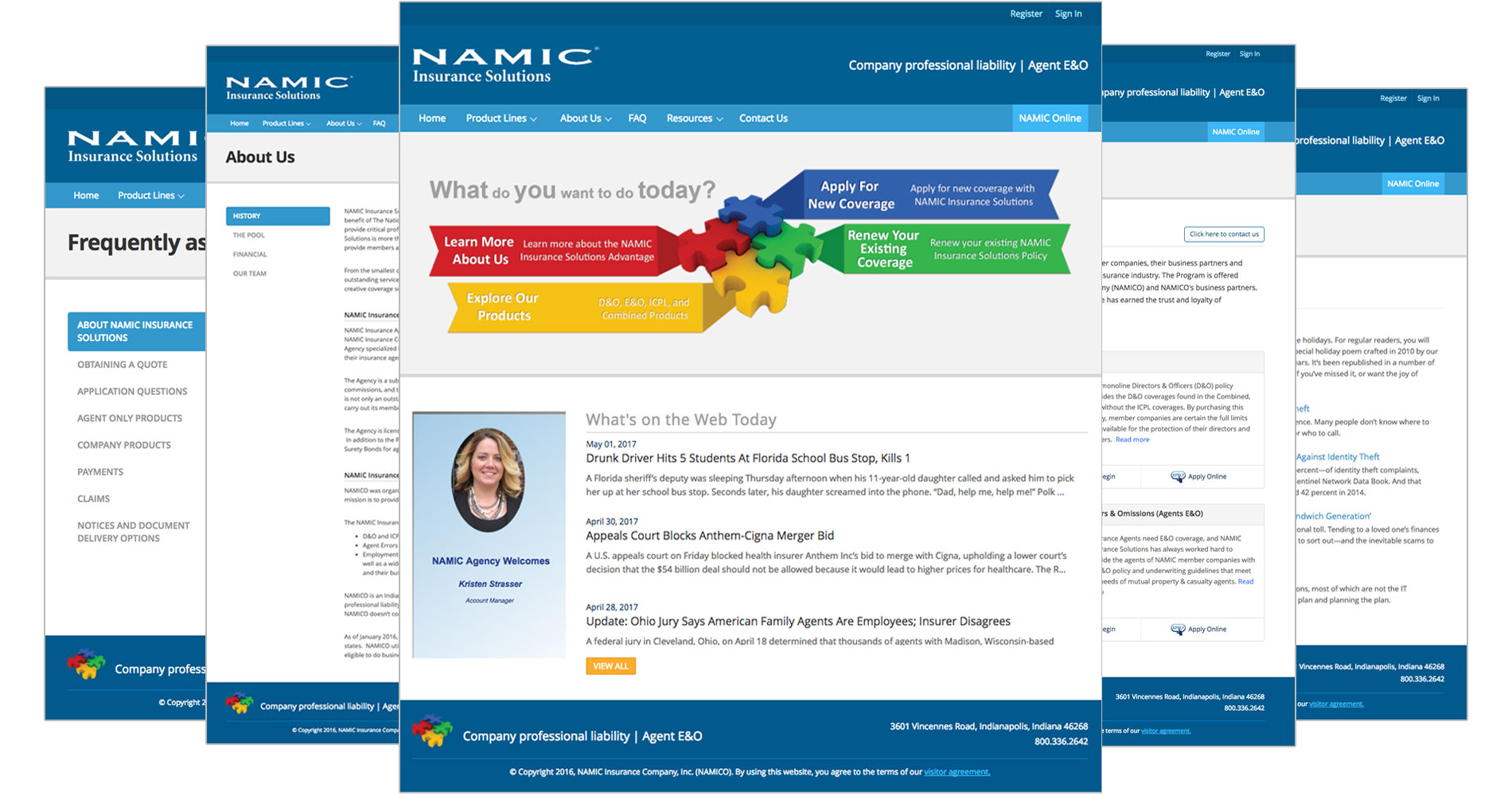
We put together a team of designers, developers and a tester to define the user journey of the client's customer. We tested the entire website to identify the pain points of where the user was getting confused during navigation, and simplified it. We discovered that the user was most interested in checking the latest news and events of the organization, so we put this information on the homepage.
To balance the warm, bold colors of their logo, we chose a palette of cool colors for the website which also highlighted the professional image they wanted to project in the insurance industry.
After doing A/B testing, we came up with a simpler form for the online registration process.UI & UX Design
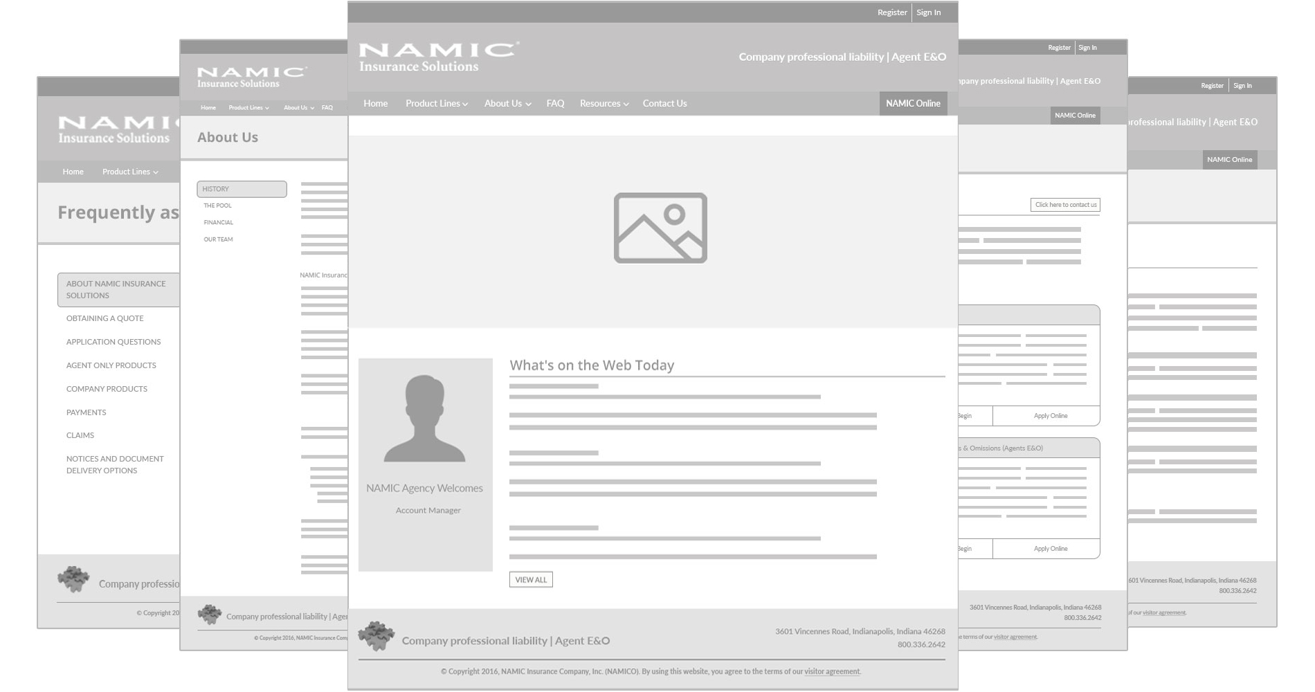
Slide to see how we design this from wireframes to the final design.
 Final Design
 High-Fidelity Wireframes


