Website & Mobile App for Home Loans
Our Challenges
To simplify applying for a mortgage, our client wanted to remove the commission-based person from the process. Our challenge was to make the experience so easy that any age user could successfully apply. After the user goes through an online interview process to complete the application, it is their choice to download the report or to hire someone from the client's team for further mortgage application assistance. To meet the expectations of this audience of home buyers, the client wanted this user experience to be seamless.
Users would be applying for mortgages via desktop and via mobile. The client asked for help with their mobile app to make the online interview process user-friendly. The client also wanted users to be able to access the information they provided on mobile devices when continuing the process on desktop. Our challenge was to make the interview journey sync on every device that the user utilized in the mortgage application process.
The client asked for a secured login set up. We needed to ensure that the process to access reports and other information remained safe, yet it did not become too difficult for the users.
Another challenge was to create the banner animation relative to the web browser scroll. In the banner, we had multiple layers of images which needed to animate according to the browser scroll. This had to work on all web browsers as well as mobile devices.Our Approach
The client visited our office to bring us up to speed on mortgage terminology. We discussed the different flows of the mortgage application interview questions which helped us to understand the pain points of the users. We created the prototypes of each question and used security to test the experience. The client approved the wireframes, and found it helpful that he could use the wireframes to change the user engagement process when necessary.
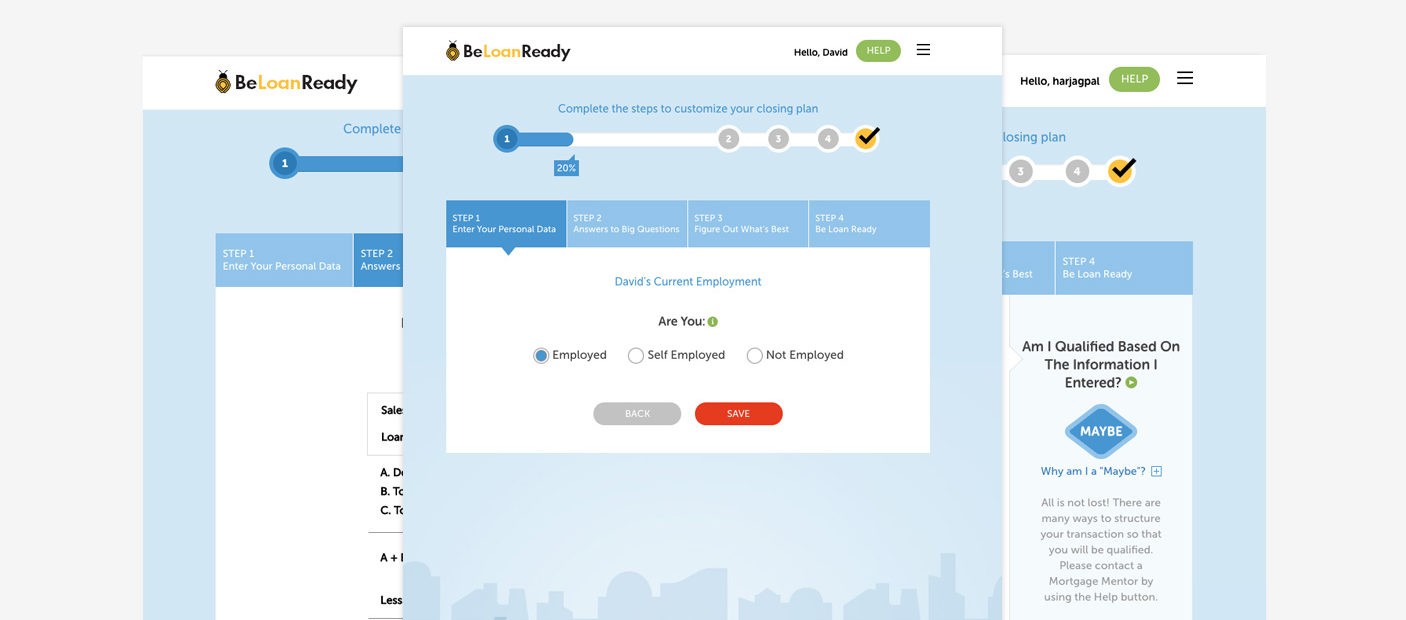
Since the user could apply via mobile or desktop to see if they could qualify for a mortgage, the client provided us with the PDF file of the interview document and we converted this into a digital form for the app.
An easy-to-use but secure login system was created to keep users form information confidential whether they logged in via desktop or mobile.
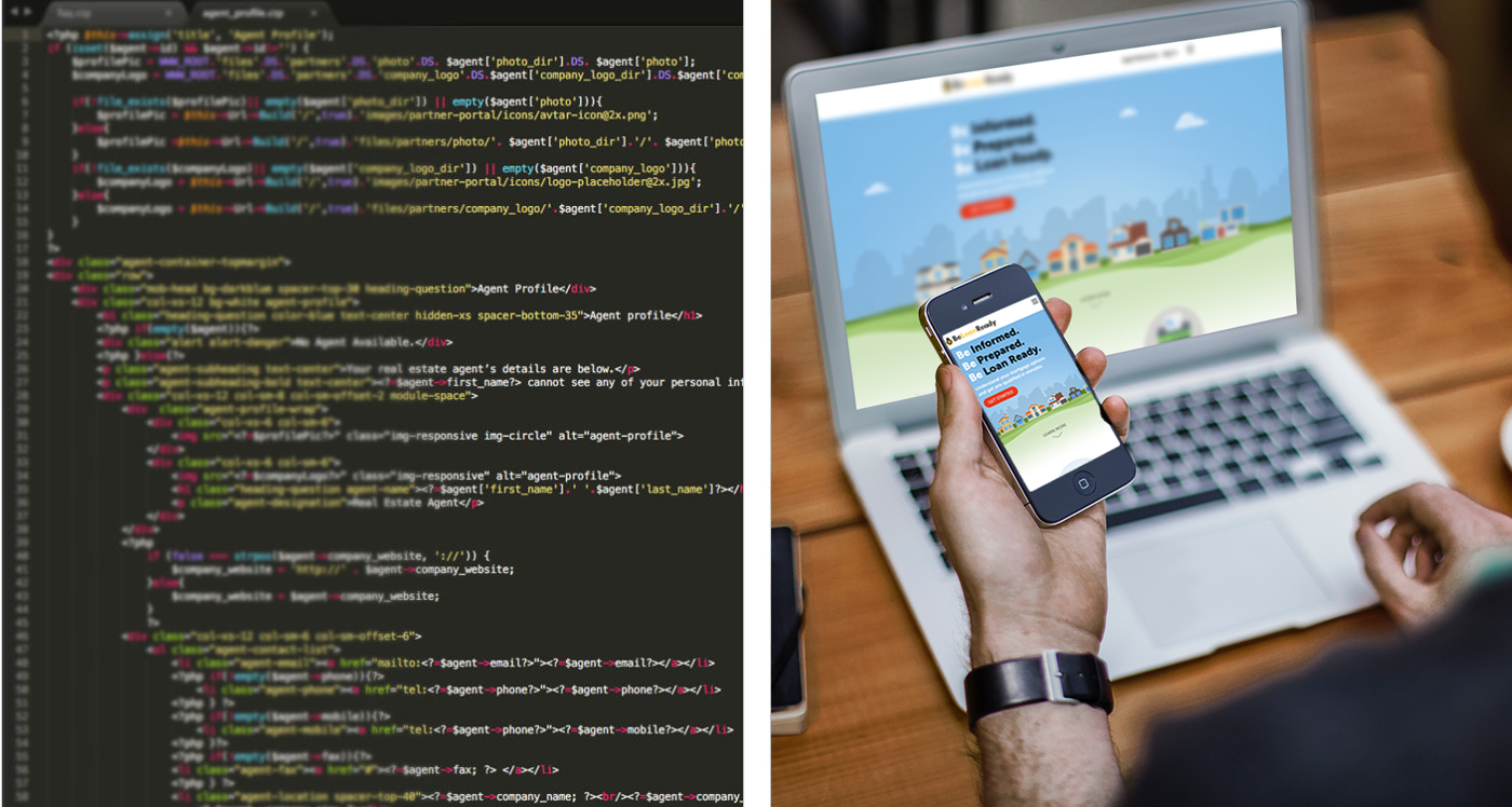
To create the banner with multiple layer animation, we used the browser scroll event for the filter layers and set the variable to all layers container using JavaScript. After that, we applied the calculation to each layer so that layers can move relative to each other with the browser and the mobile devices to scroll smoothly.
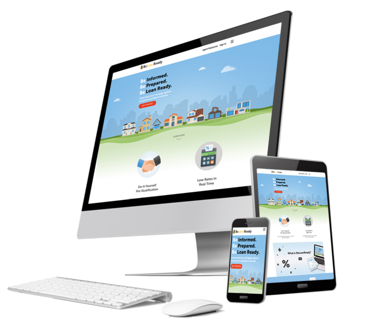
To ensure that the website and web app responses worked on multiple mobile platforms and screen sizes, it was coded in HTML5 and JavaScript. The responsive design insured that the app displayed consistently on multiple devices.UI & UX Design


